It was a major PR failure in 2007. The IPCC won’t make the same mistake again. They’ve dumped the hot-spot graphs.
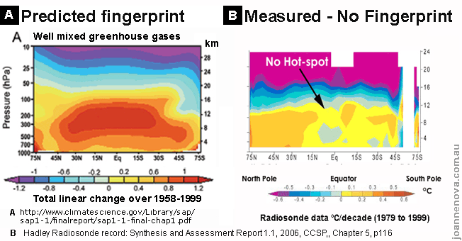
The classic hot spot prediction (A) compared to 28 million weatherballoons (B).
In AR4 they put in two graphs that show how badly their models really do. In the next report they plan to bury the spectacular missing-hot-spot images through “graph-trickery” and selective blindness. Each round of IPCC reports takes the spin-factor up another notch. It’s carefully crafted.
It’s hot-spot hidey games and PR tricks
In the new extra-tricky AR5 version, the IPCC “quote the critics” and ignore them at the same time. That way they can say they include the McIntyre’s, McKitrick’s, Douglass’, and Christy’s: the words are on the page, but that doesn’t mean the information is used in the conclusions. The models have failed and they bury that undeniable result under the clutter. (You’ll need to read the fine print). There is no acknowledgement that this issue of the “hot spot” drives more amplification of predicted warming in their models than any other point (though that is obvious and implicit in Fig 9.44, and you can see that below). Which policymaker exactly is going to notice that?

Reblogged this on Standard Climate.
Posted by Standard Climate | April 25, 2013, 7:15 pmReblogged this on Standard Climate.
Posted by Standard Climate | April 25, 2013, 7:16 pm